Saturday 23 January 2016
Friday 22 January 2016
Progress Report – 20 January
- Work completed since 6 January
- Since 6th January, all pre production work has been completed and a small portion of the filming for the film has been done. As well as this, as of today I have also completed the photo shoot for the images I wish to use in my print production. I think that having these things completed for both the group and individual task, puts me in a good position as I am confident that I can meet the deadline. Also, having the photos done for the magazine means that I can now go onto experimenting on photo shop looking at how my magazine will look and brainstorm ideas of how to make it appealing to the typical art-house audience.
- Any incomplete pre-production tasks
- To the best of my knowledge all pre production tasks are complete and uploaded to the blog as final copies. Individually, I will be putting the storyboard into my folder either in today's lesson (22/01/2016) or by next Wednesday as it is the piece of the pre production tasks that I have completed.
- Next steps/Action plan
- The next steps for me to complete my coursework will be completing the filming with my group and editing it. As well, has completing the filming next steps also include starting to assemble my magazine on Photoshop piece by piece which will eventually become my final magazine. Further steps to my action plan are to make sure that everything necessary is in my folder. Once the group work and individual tasks are completed then as a class we will be doing our evaluations. Overall, I want to ensure that I meet all the deadlines and complete work to the best of my ability.
- Date filming will be complete
- As an estimation, because the majority of the filming will need to be done at the weekends and after school I think that it will all be completed and ready to edit by half term. However, this is an estimation that has not be discussed with my group.
Tuesday 19 January 2016
Print Production Research
1) Key conventions. Look over the magazine cover key conventions notes sheet and ensure you can confidently identify the key aspects that are found on a magazine cover.
2) Write an analysis of this BFI Film Festival programme front cover. How many of the 12 key conventions of magazine covers can you see? In what way does this print product differ from a traditional magazine cover? How have the designers made this programme visually interesting?
3) Find at least 5 arts centre or cinema programmes/brochures aimed at a similar target audience to your project (arthouse cinema). For each one, pick out one design idea that you could use in your own print work.
4) Find at least 5 contents pages from arts programmes or magazines. How are contents pages designed? How do they use a combination of text and images to create an effective design?
4) Find at least 5 contents pages from arts programmes or magazines. How are contents pages designed? How do they use a combination of text and images to create an effective design?
1) How many key conventions can I identify?

2) The British Film Industry
front cover differs from the traditional magazine front cover because the title
of the publication does not actually reside in the top third of the cover. In
addition, the front cover does not have a central image to follow the title of
the publication instead; it has a merged collage within the writing of the title.
The title of the publication has been carefully created to be eye catching and
placed in the centre of the page making it the key focus of the cover. This
helps to make the front cover more aesthically pleasing to the public eye among
all other magazines on the shelf.
Another aspect is the
placing of the date on the front cover; typically, the date is placed in small
font at the bottom of the page with no real significance. However, in the BFI
front cover the date has been placed directly underneath the title of the
publication. This is because the dates are the dates for the festival, which is
an important piece of information for the audience. The BFI front cover is also different in comparison
to the traditional front cover because it is very simple and is not overloaded
with information.
On the other hand, the BFI
magazine front cover also does match a traditional magazine as the BFI logo has
been placed in the top left of the page, which is typical of any magazine logo.
-- Placing the title in the bottom third of the page
-- Having a central image, close up of half a characters face

-- I really like that the central image is the key focus of this brochure with minimal text
-- I also like that the brochure issue is located as vertical text to the right of the page which is something that I could use
-- I could also use the idea of putting the BFI logo in the top right as a gift tag with accompanying social media and other information directly below. Rather than having it in the bottom left of the page in small font
The Plymouth Arts Center

-- In this brochure I like the way that the title of publication differs from the traditional format of consuming the top third of the page and instead it is in the top left of the page.
-- I also like the fact that the front cover is not over filled with text, which is something I will consider doing. This is because, less text on the front could make a audience want to read in more detail.
-- I also like that the central image is in black and white rather than colour as it helps it to stand out from competitors brochures such as the Salisbury Art Center which is consumed by colour above

-- I really like that this film contains all the generic key conventions of a film magazine front cover where you would expect them. For example, the title of the publication is in the top third of the page
-- Ideas that I would use: I would use the idea of a brief listing of the upcoming key events on the front cover and the fact that the image consumes the whole page and writing is placed on top but it is not overloaded with the key characters faces still clearly visible.
-- From this publication what I like about it is that it is landscape page orientation
-- I also like that fact that the front cover promotes what the cinema has it tells readers that there are " 3 cinemas and a cafe bar"
4) Contents Pages

-- I like that this contents page is not overloaded with images and follows a very simple layout

-- This contents page holds ideas that I could use because the words "contents" are not at the top of the page as you would typically find them. Instead they are vertically written down the left hand side of the page.

-- I like this contents page because rather than squeezing the information onto on page and the text is on the bottom half of the two pages with two eye catching images above to grab the attention of the audience.

-- I like that this contents page because it focuses on the features of the magazine rather than overloading it with images. However, I think that this contents page is too common and is not very appealing to audience to make them want to read more.
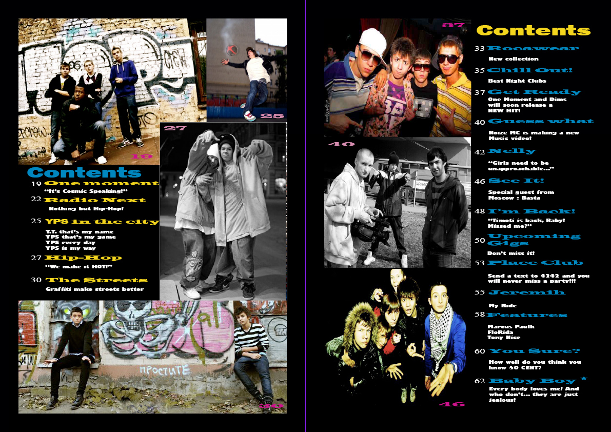
-- Finally, I like this contents page because the text isn't just down one side of the page but it is also on the left hand side surrounded by images on a simple black background. This is definitely something I am considering using for my print production. I think it is a bespoke way to present the main features of the magazine that follows.
Sunday 17 January 2016
Planning & Sketching
Task
1) Create a spider diagram or bullet point list of all the things your target audience might be interested in. How can you use this information to create a main feature about your film that will appeal to your target audience?
2) Produce an A5 sketch of your front cover including the key conventions and design tricks you have studied in existing programmes and then planned in planning task 1 above.
3) Produce an A4 sketch of your double-page spread contents page. In terms of the text for your contents page, you will need to find out the names of the films of other groups in your class. The other films in the class will make up the rest of your contents page.
4) Create a spider diagram or bullet point list of ideas for your double-page spread feature. Write a list of potential headlines and sub-headings for the article you choose to go with.
5) Produce an A4 landscape sketch of your double page spread design now you have chosen the subject matter.
1)

2) Sketch - Front Cover

3) Sketch - Contents Page

4) Features for the double page spread:
-- Description on the right hand page of the film
--Surround main features with critics comments
-- One large image on left
-- A series of pull quotes around the large images
-- Section " What makes a fantastic arthouse film"?
5) Sketch - Double Page spread

Friday 15 January 2016
Photoshoot - Print Production
TASK - PHOTOSHOOT
1) Which of your main characters will appear on the front cover of your programme?
2) What image or images do you need for the contents page?
3) What image or images will you use for the double-page spread?
4) Write a shot list for the photoshoot. Make sure you plan a variety of camera shots you will look to capture - medium shots, close-ups etc.
5) What costume, props or make-up will you require for the photo shoot?
6) How will you make sure you have everything prepared for the photo shoot on Wednesday 20 January?
1) For my photo shoot I am planning to have a central image using the main protagonist (Katie) and the boyfriend. If this idea runs into problems because the person cast in the role of the boyfriend is not able to come to the photo shoot then my back up idea is to use something which revolves around the main protagonist finding out that her boyfriend cheated. Eg: Katie boyfriend cheating kissing some other girl with Katie watching from a distance.
2&3)
4) In relation to the costume props etc, as far as I have been informed Katie will be buying all of the make up for shooting the film and I am likely to use the same make up/make up styles in the photo shoot. Alternatively, I plan to just go for a simple minimal make up face for my characters in my print production.
5) To ensure that everything is ready for the date of the photo shoot I am going to use a completed version of the draft check list snapshot below:

Thursday 14 January 2016


Subscribe to:
Posts (Atom)